A few interesting modern pixel fonts
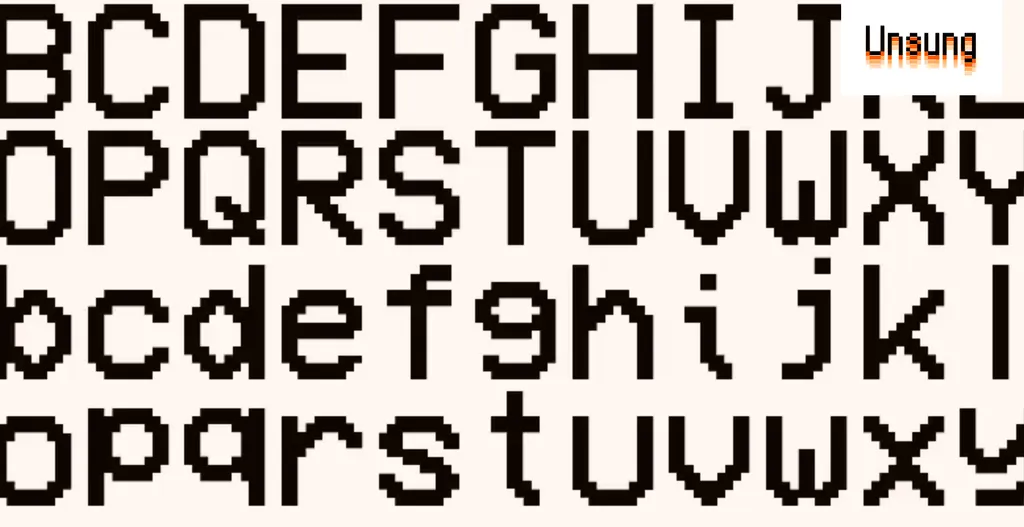
The article discusses several modern pixel fonts designed to address issues found in traditional pixel typography. Notable fonts include Analog Mono, which corrects baseline problems, and Coral Pixels, which incorporates nostalgic color fringing. Geist Pixel is highlighted as a functional tool designed for real usage, overcoming common challenges faced by pixel fonts in production.
- ▪Analog Mono was designed to fix issues with the classic VCR OSD Mono font.
- ▪Coral Pixels features colorful fringing reminiscent of the 1990s and 2000s.
- ▪Geist Pixel aims to be a functional tool within a typographic system, addressing common pixel font problems.
Opening excerpt (first ~120 words) tap to expand
A few interesting modern pixel fonts Andrew Gleeson designed Analog Mono, “fixing the crimes of VCR OSD Mono.” There used to be this classic pixel font that you’d see everywhere in the 1990s on hi-fi equipment: VCRs, TVs, camcorders, etc. One of its challenges was a low baseline which resulted in all the letters with descenders pulled up, for example: Analog Mono fixes that problem: Elsewhere, Kumiko Yoshida made Coral Pixels (also on Google Fonts), a color font that comes with the 1990s and 2000s colorful fringing baked in. The fringing was once an artifact of subpixel rendering, but now it is meant to evoke nostalgia or just as an interesting visual element in and of itself.
…
Excerpt limited to ~120 words for fair-use compliance. The full article is at Hacker News (Newest).
Discussion
0 commentsMore from Hacker News (Newest)