
Simplifying our homepage helped increase trial signups
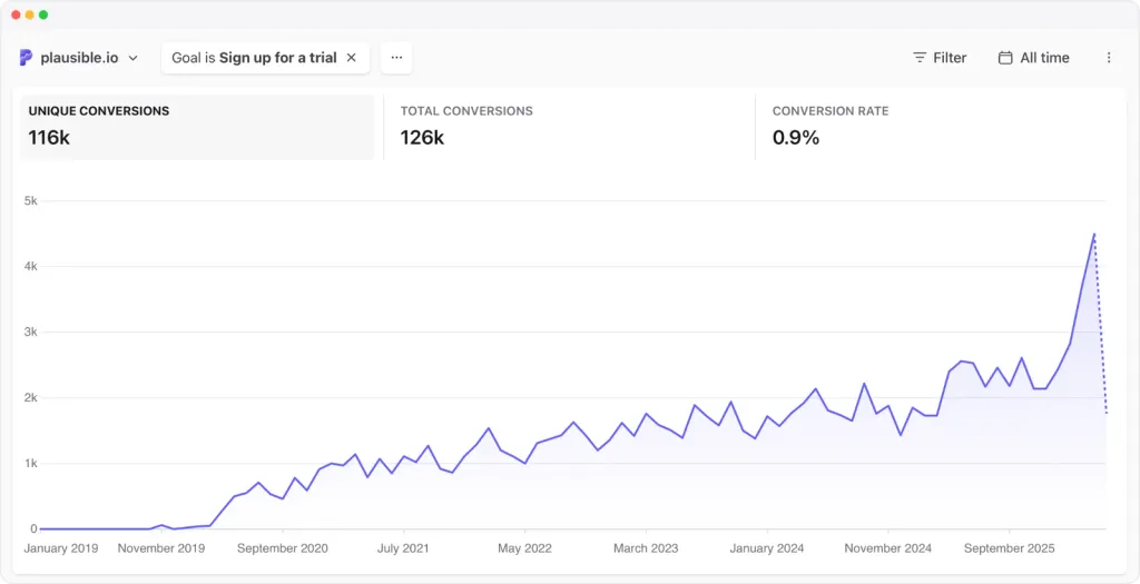
A recent update to the homepage of a company led to an 84% increase in trial signups. The changes included restructuring the page layout and simplifying the call-to-action buttons. These adjustments made it easier for visitors to quickly understand the product and its benefits.
- ▪The homepage was restructured to prioritize the feature grid, allowing visitors to see key features immediately.
- ▪Call-to-action buttons were changed from vague phrases to more descriptive ones, clarifying the trial process.
- ▪The amount of text on the homepage was reduced by half, focusing on the most relevant information for potential customers.
Opening excerpt (first ~120 words) tap to expand
← All posts How simplifying our homepage helped increase trial signups by 84% May 12, 2026 • Written by Marko Saric April 2026 was our best month ever. We added more new paying subscribers than in any other month in our seven-year history. For three months running, from February through April, we set new all-time records for both trial signups and new paying customers. We didn’t launch a new feature. We didn’t run any paid ads. We didn’t get a viral blog post or a lucky mention on Hacker News. What happened was much less dramatic than that. In late January, we spent a few days editing our homepage. We moved some sections around, cut some text and changed the button labels. We expected it to help a little but we didn’t expect it to have this kind of impact.
…
Excerpt limited to ~120 words for fair-use compliance. The full article is at Plausible Analytics.
Discussion
0 commentsMore from Plausible Analytics